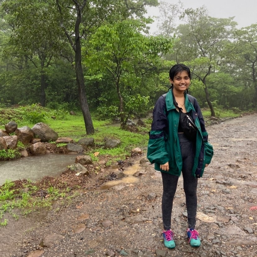
Hi, I'm Shrav, a
Multidisciplinary
with a strong research foundation, focused on understanding user behavior and translating insights into product decisions.
designerWho I am
UX and brand designer. I care about edge cases, accessibility, and the users no one modelled.
Background
I love questioning briefs and over-indexing on research, trying to understand what is actually being solved before touching Figma.
I don't start with inspiration. I start with flow.
 ദ്ദി˶ᵔ ᵕ ᵔ˶)
  designer ♡
श्रावणी
The brief might be right. It might be wrong. Research is how I tell the difference.
My design philosophy
My Case Studies
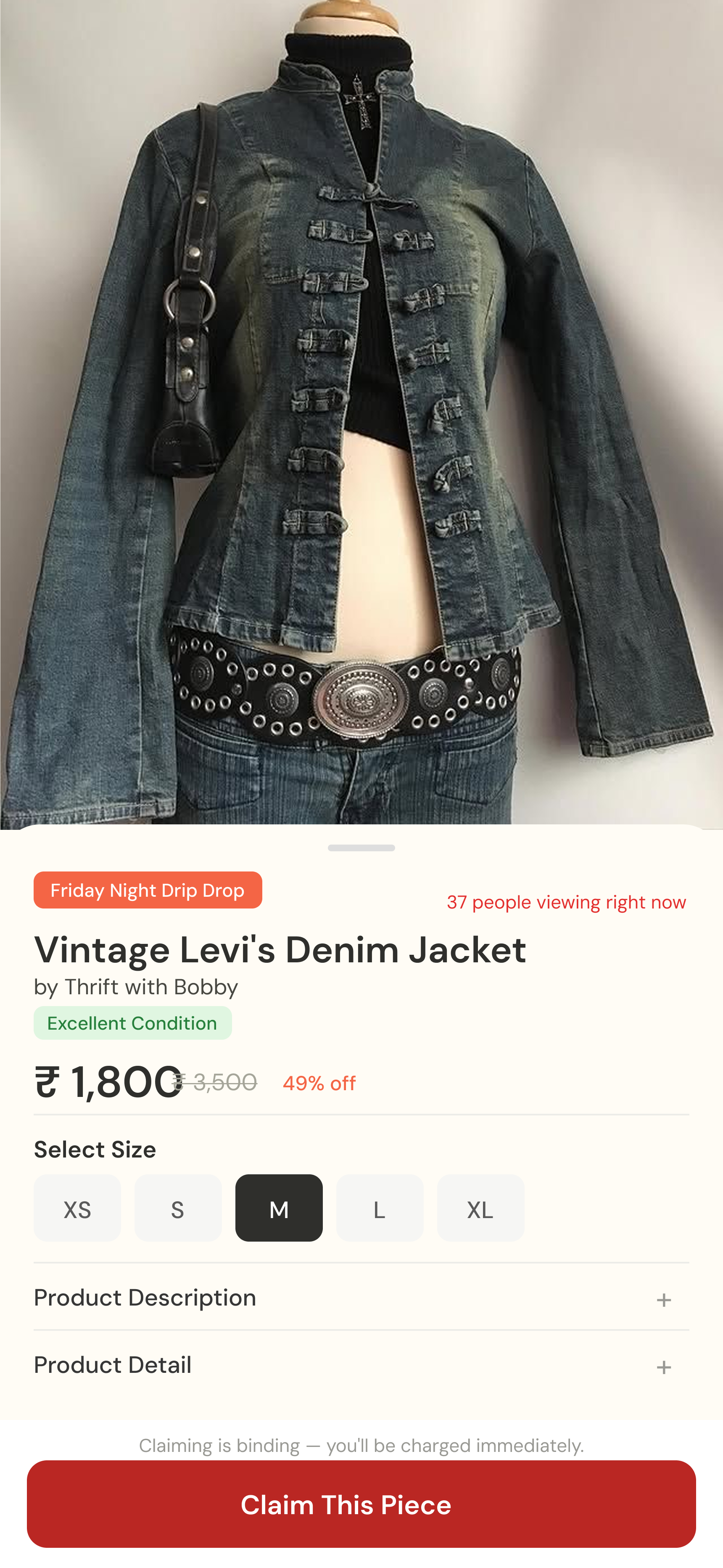
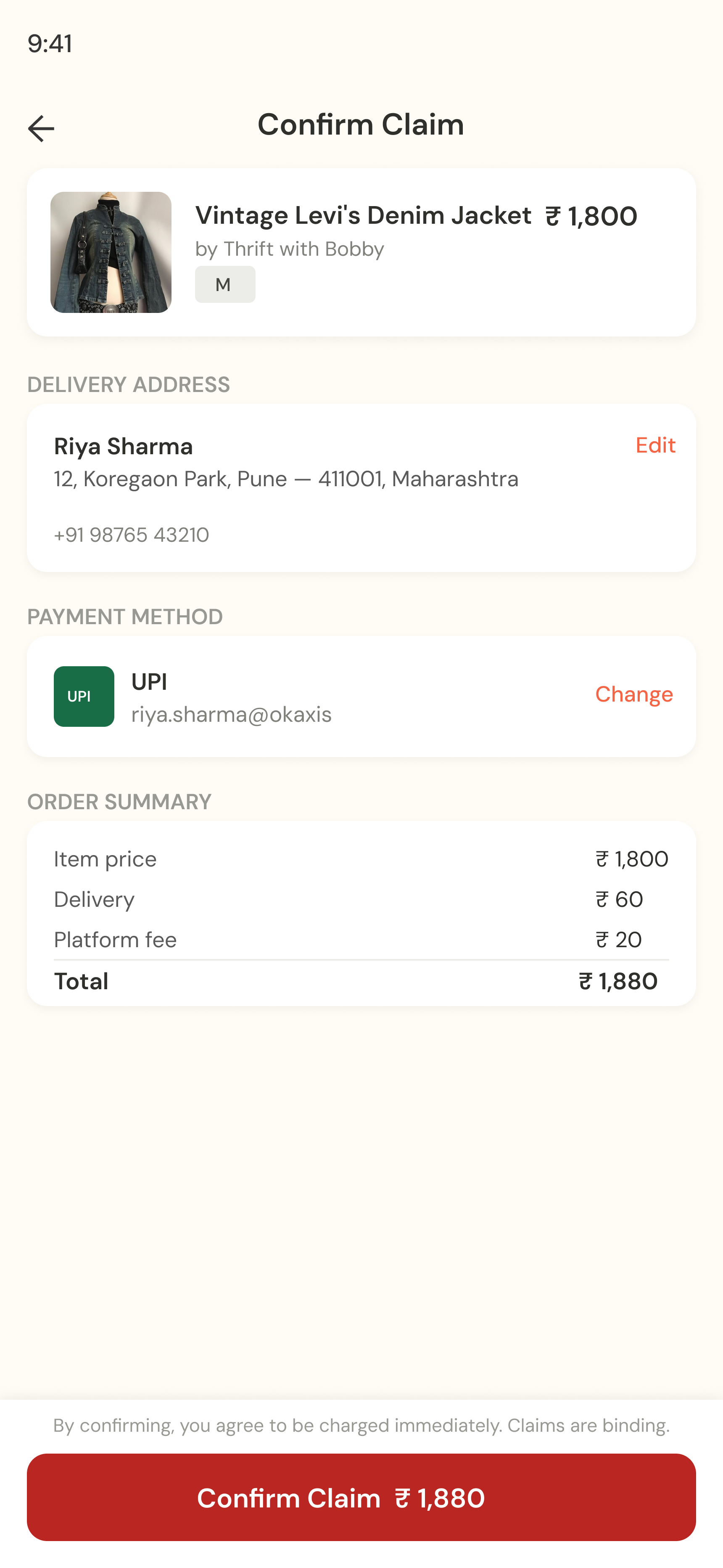
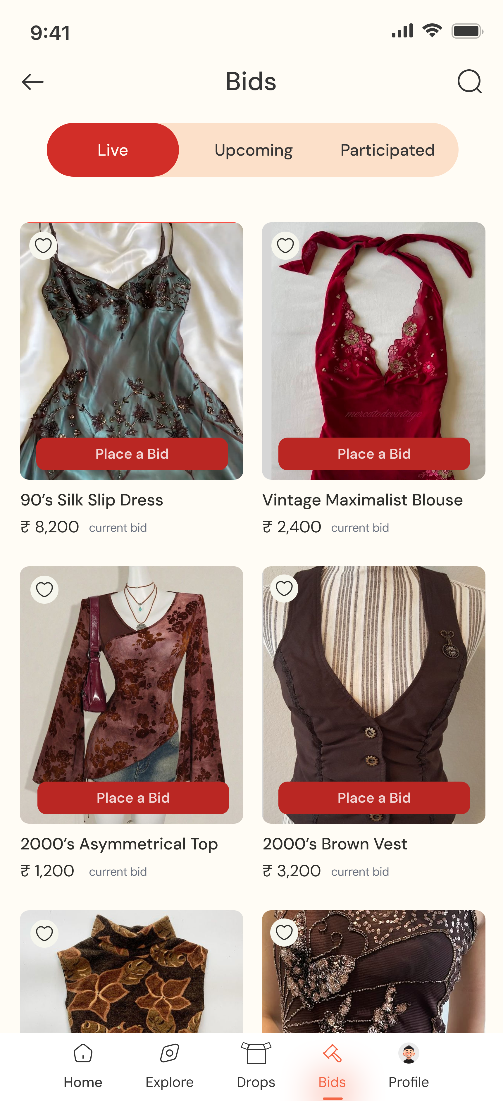
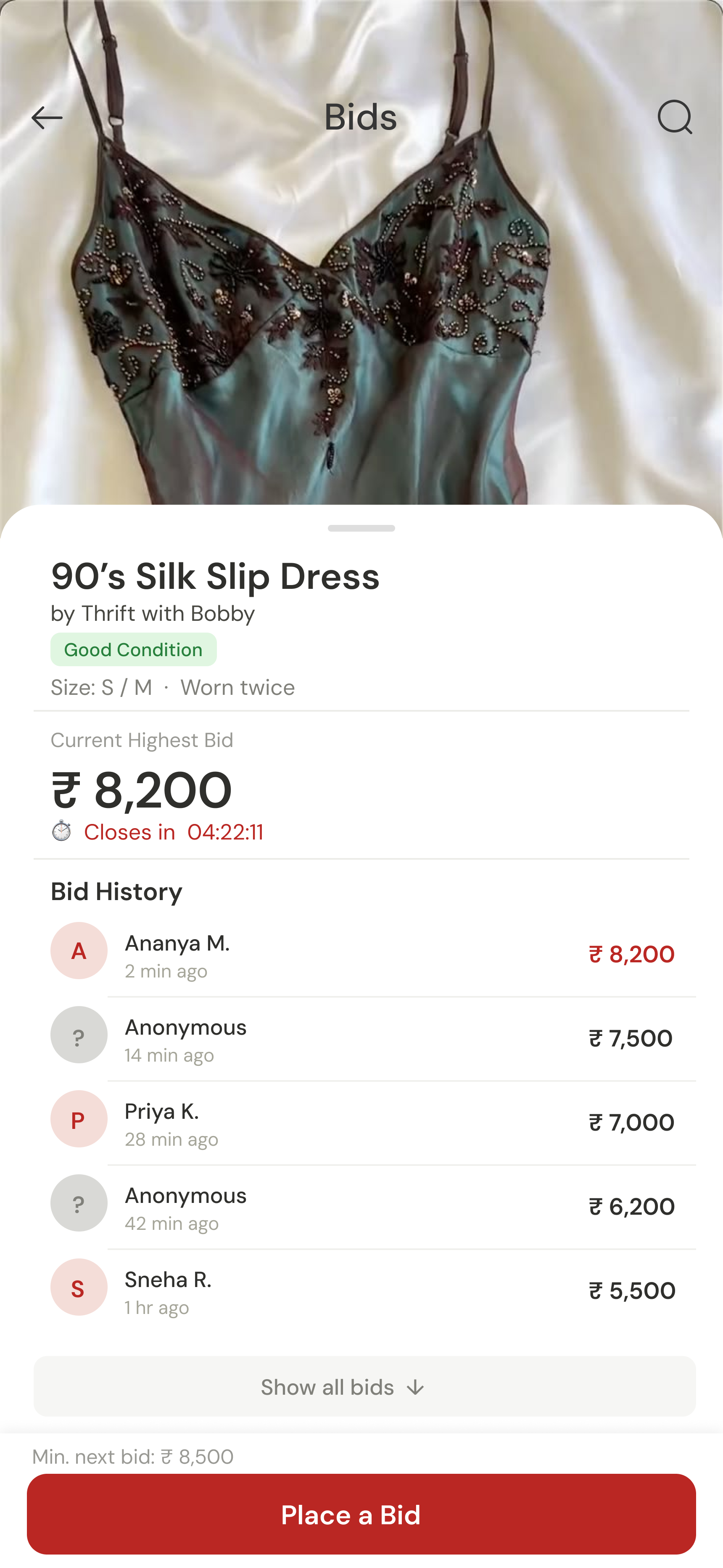
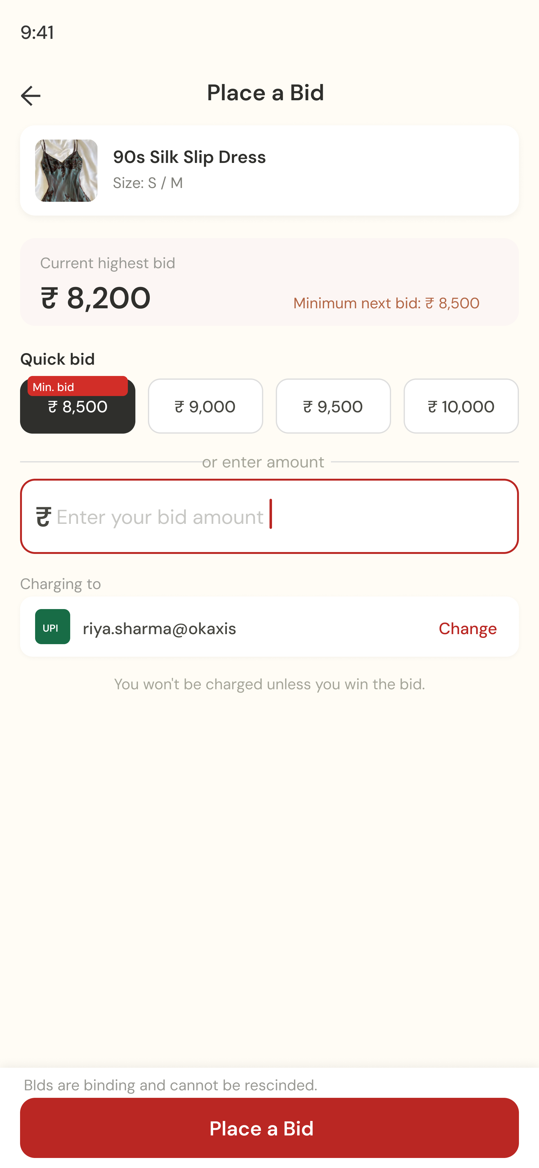
Brand + Product · Commercial Project
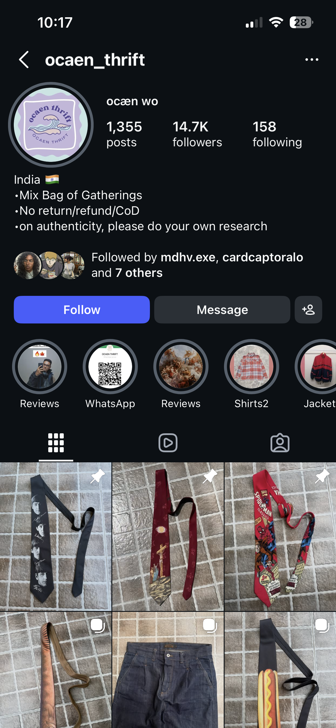
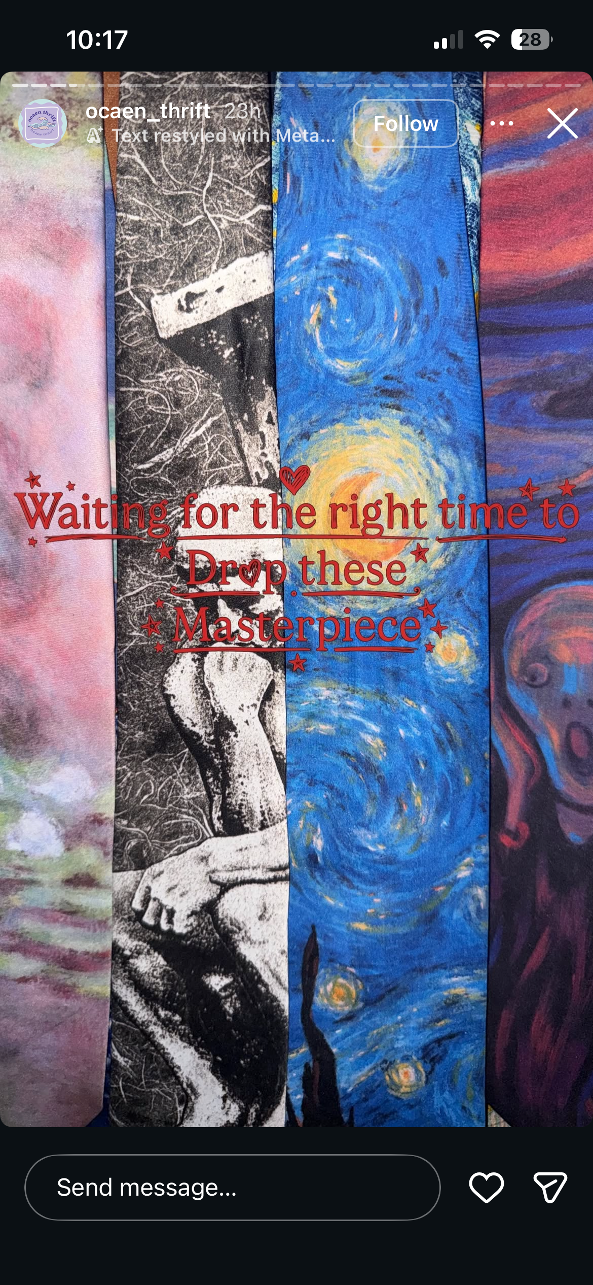
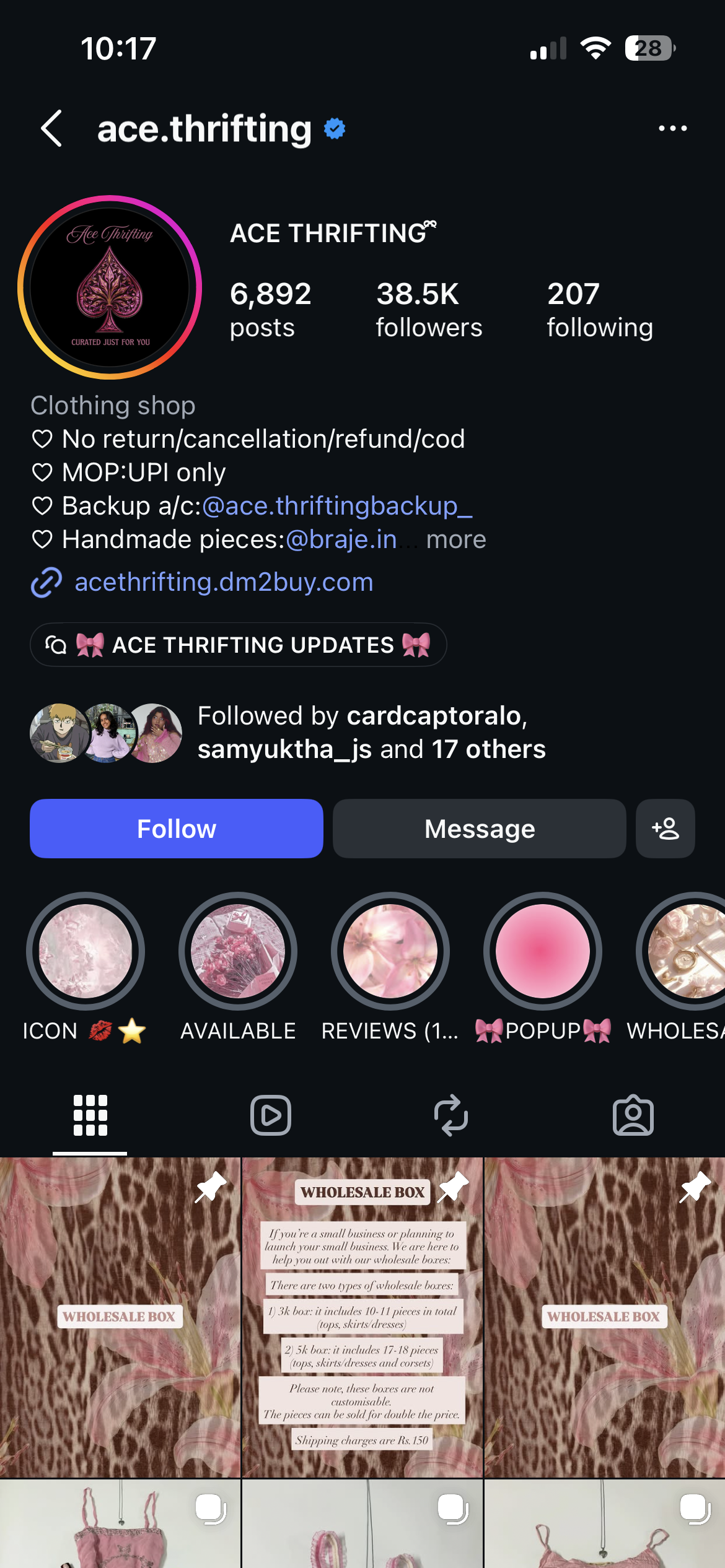
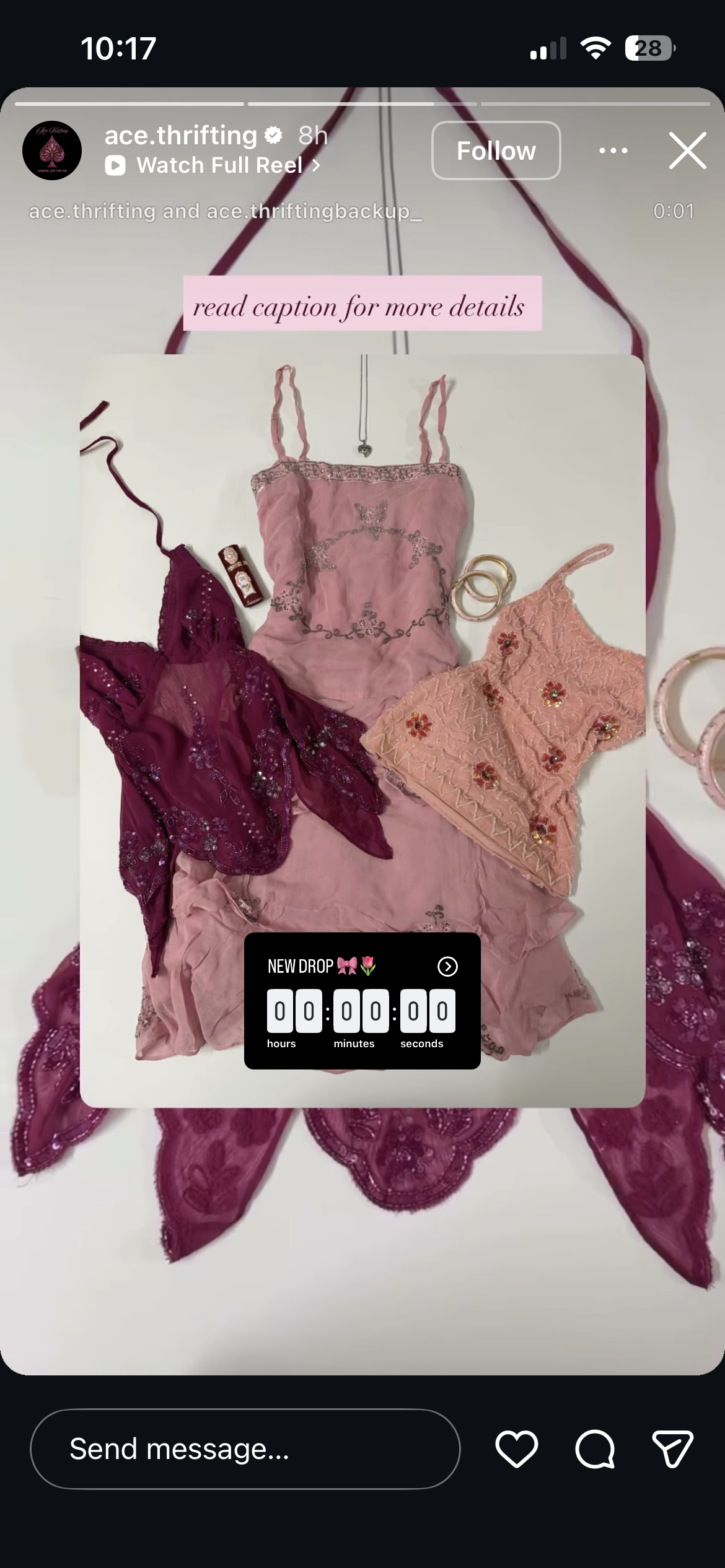
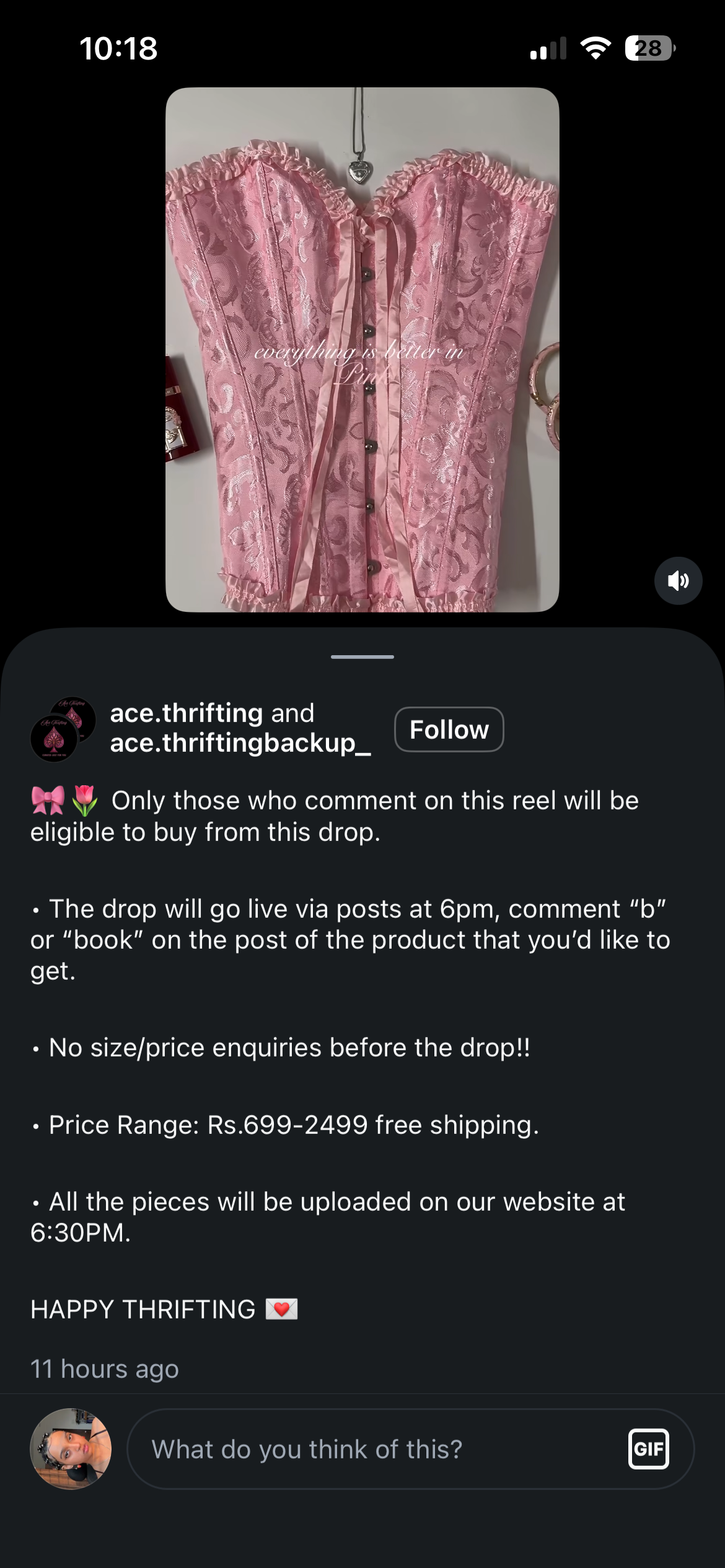
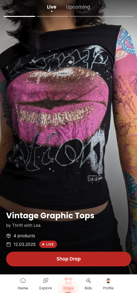
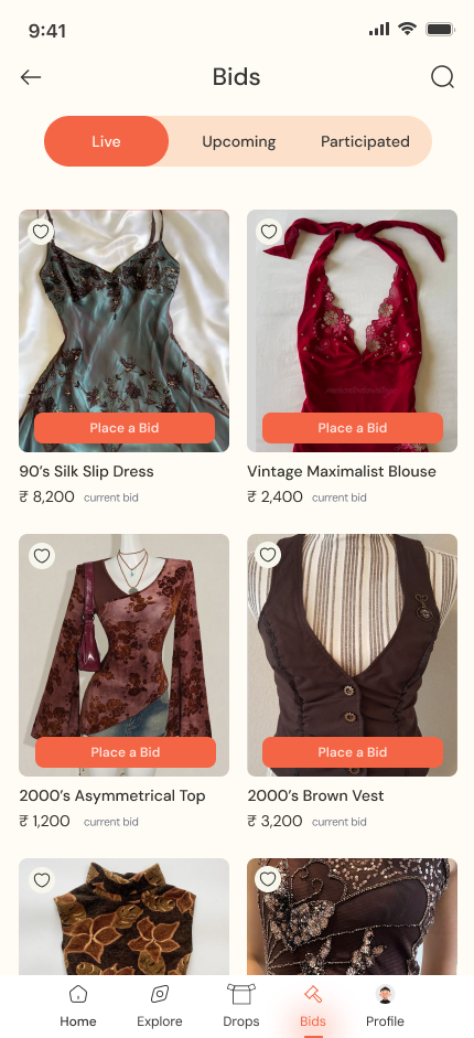
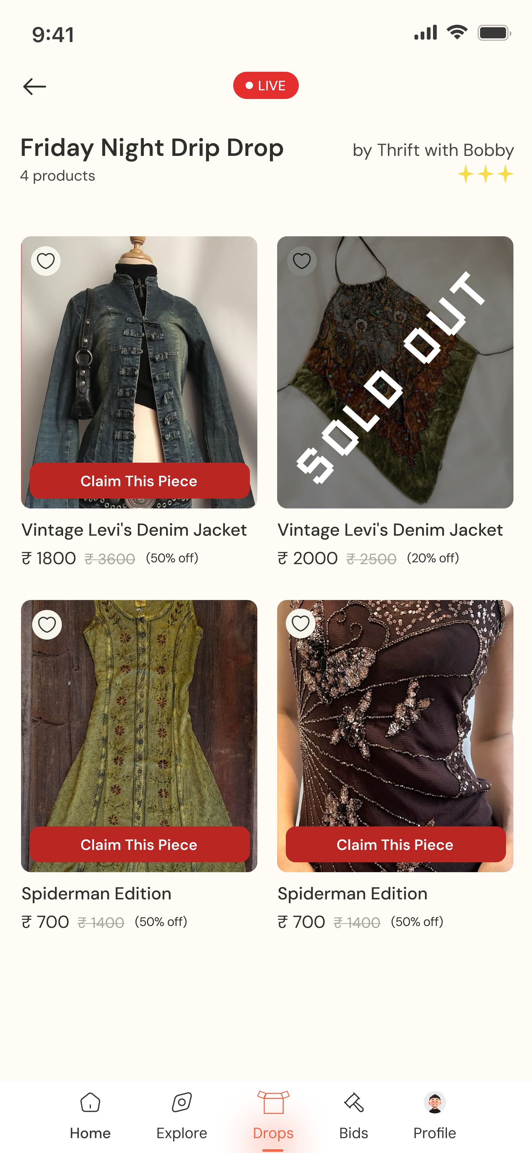
Thrift My Drip →
Brand identity and product design for a resale app built around the way Indian thrift actually works — drops, reels, and DMs.
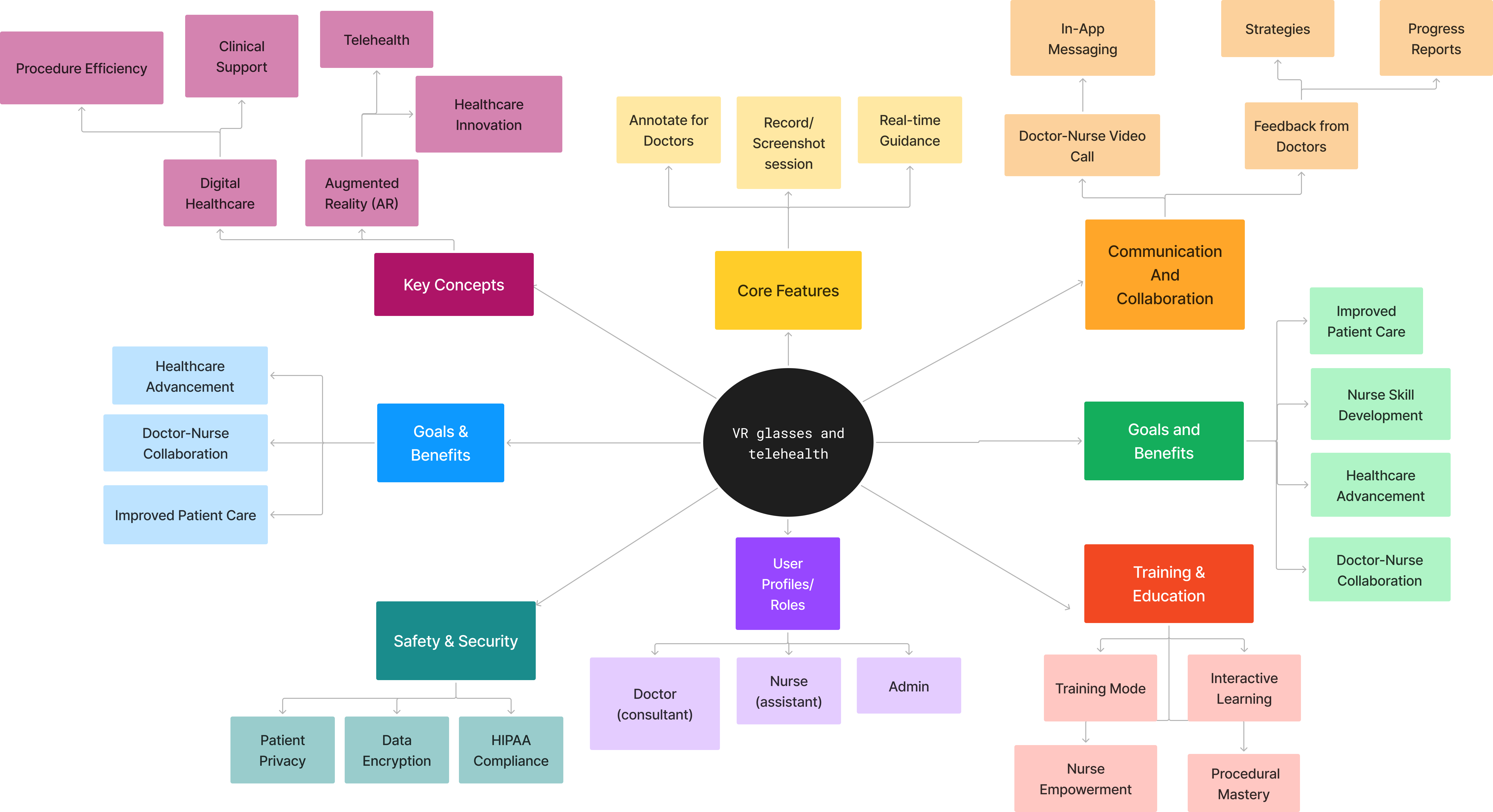
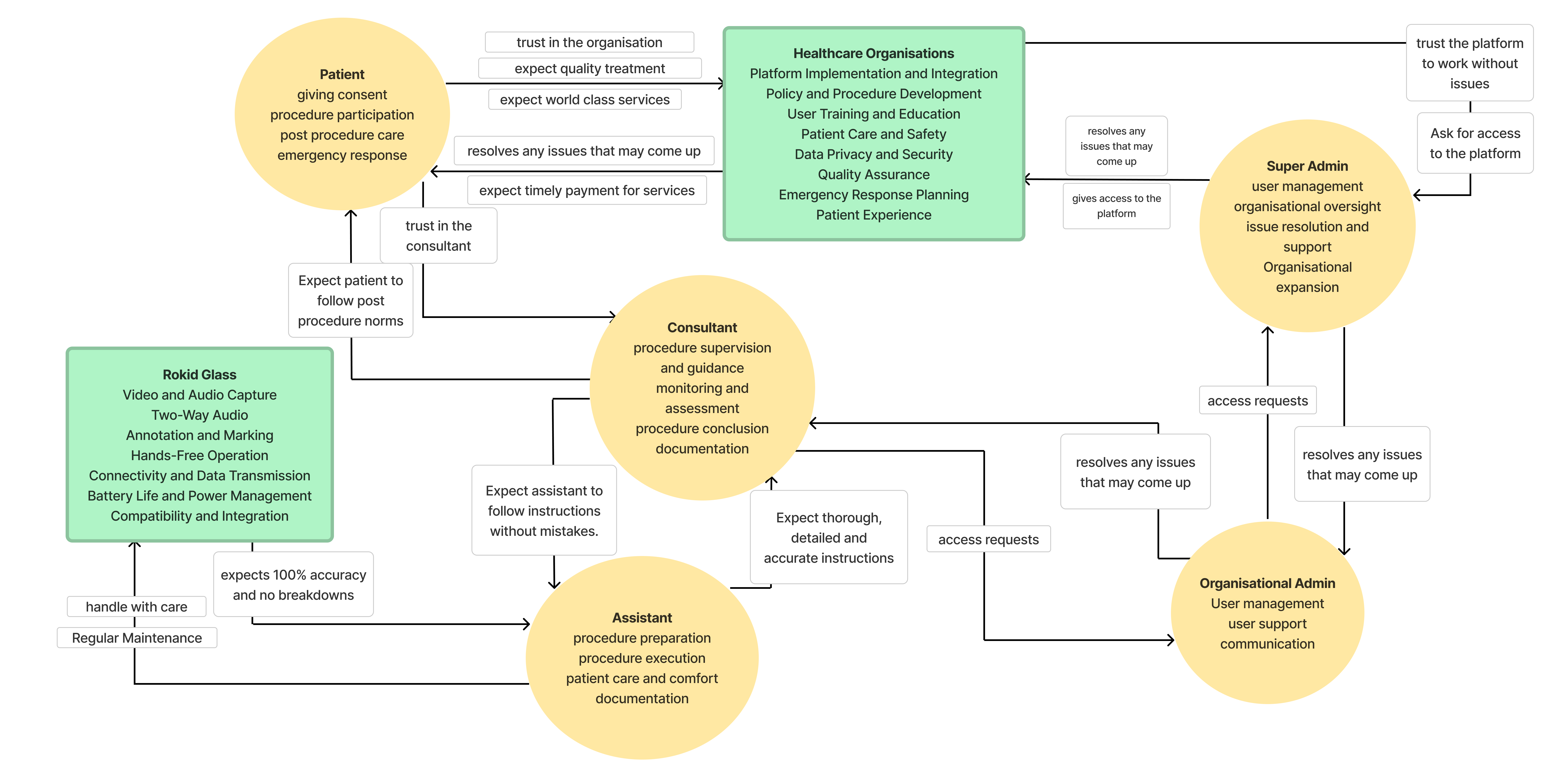
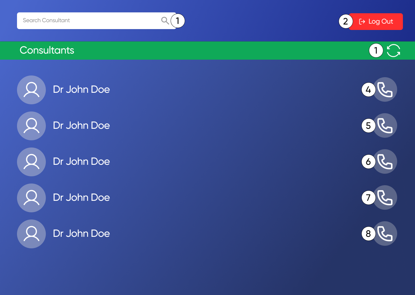
UX · Commercial Project
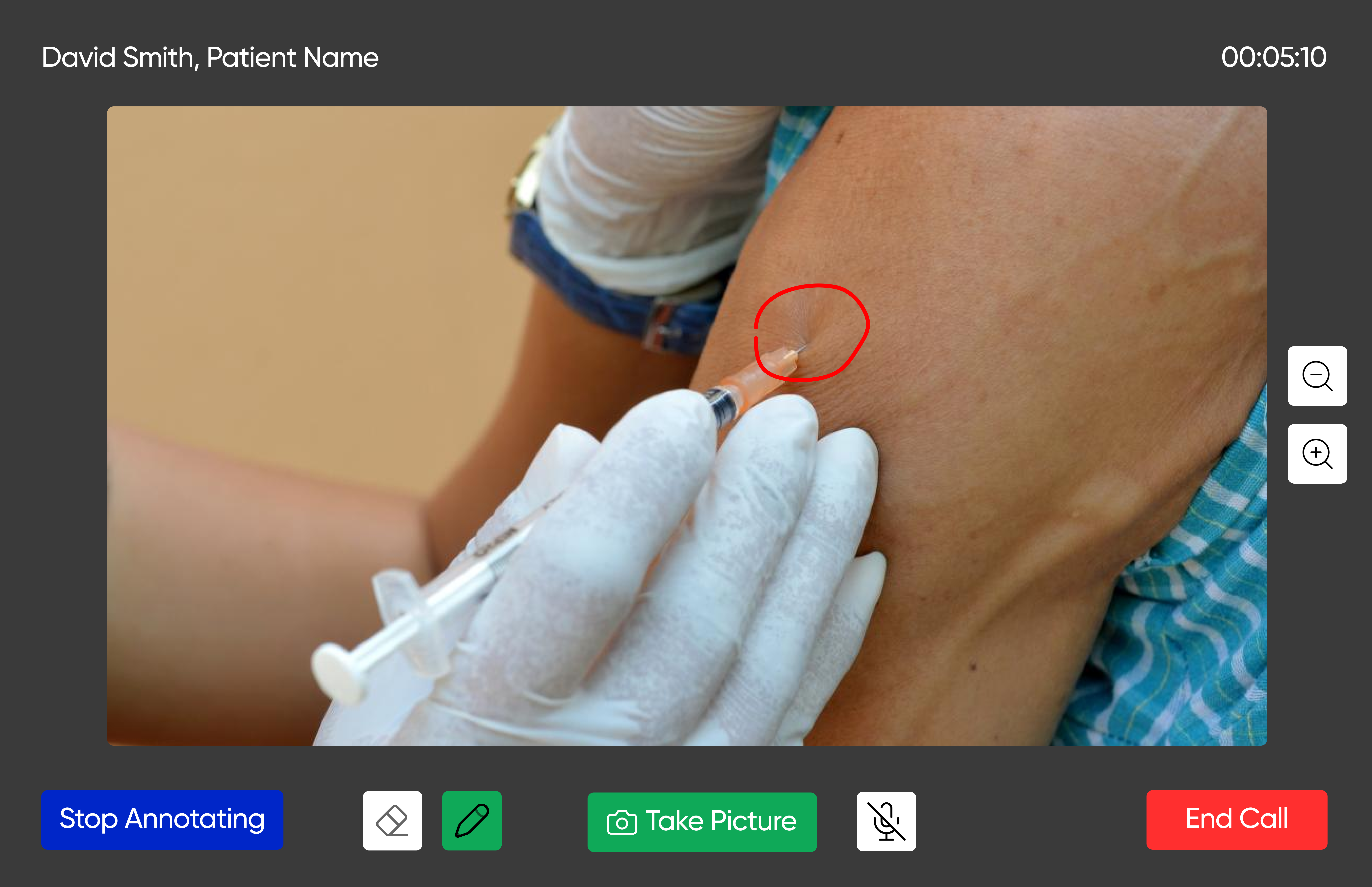
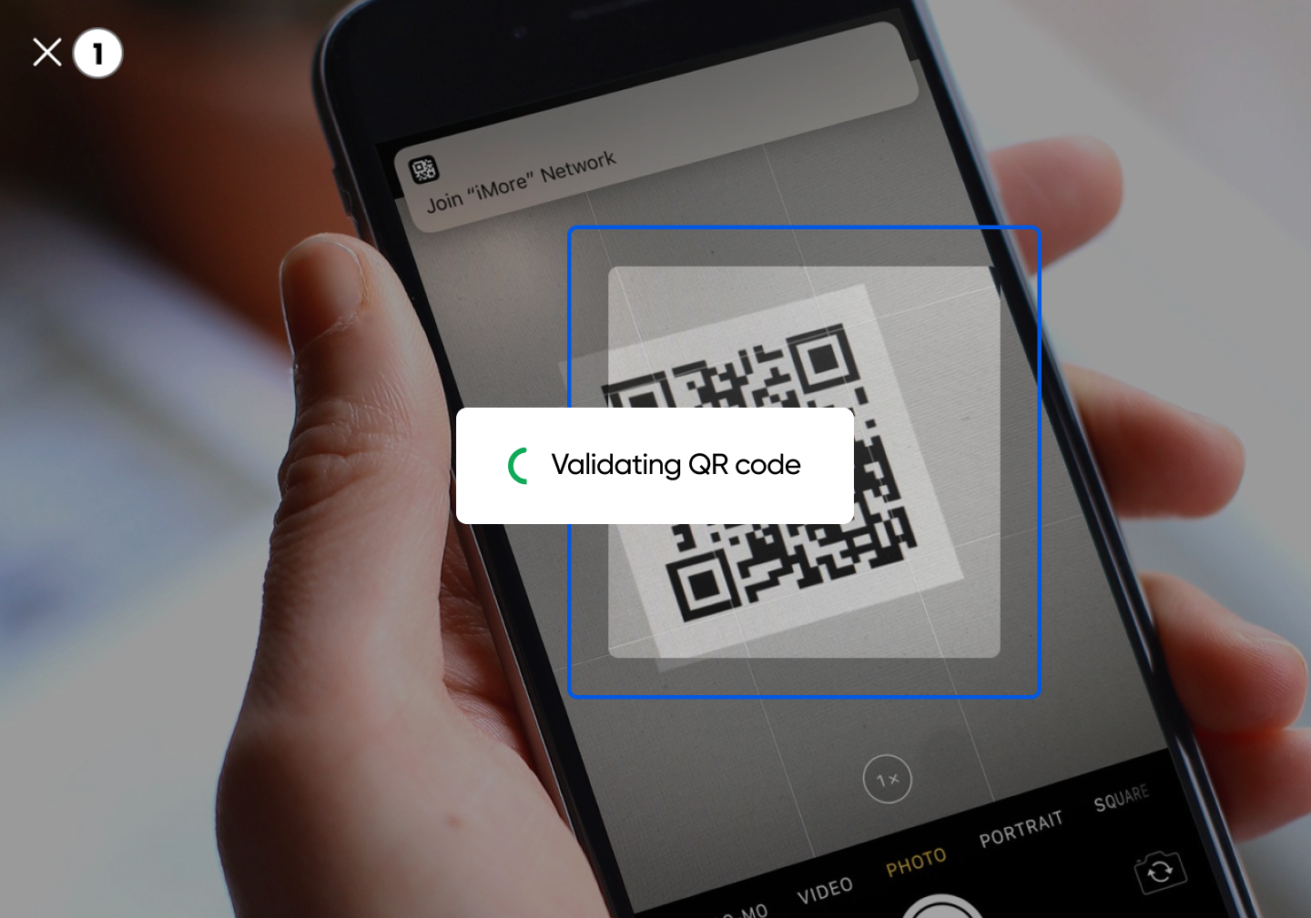
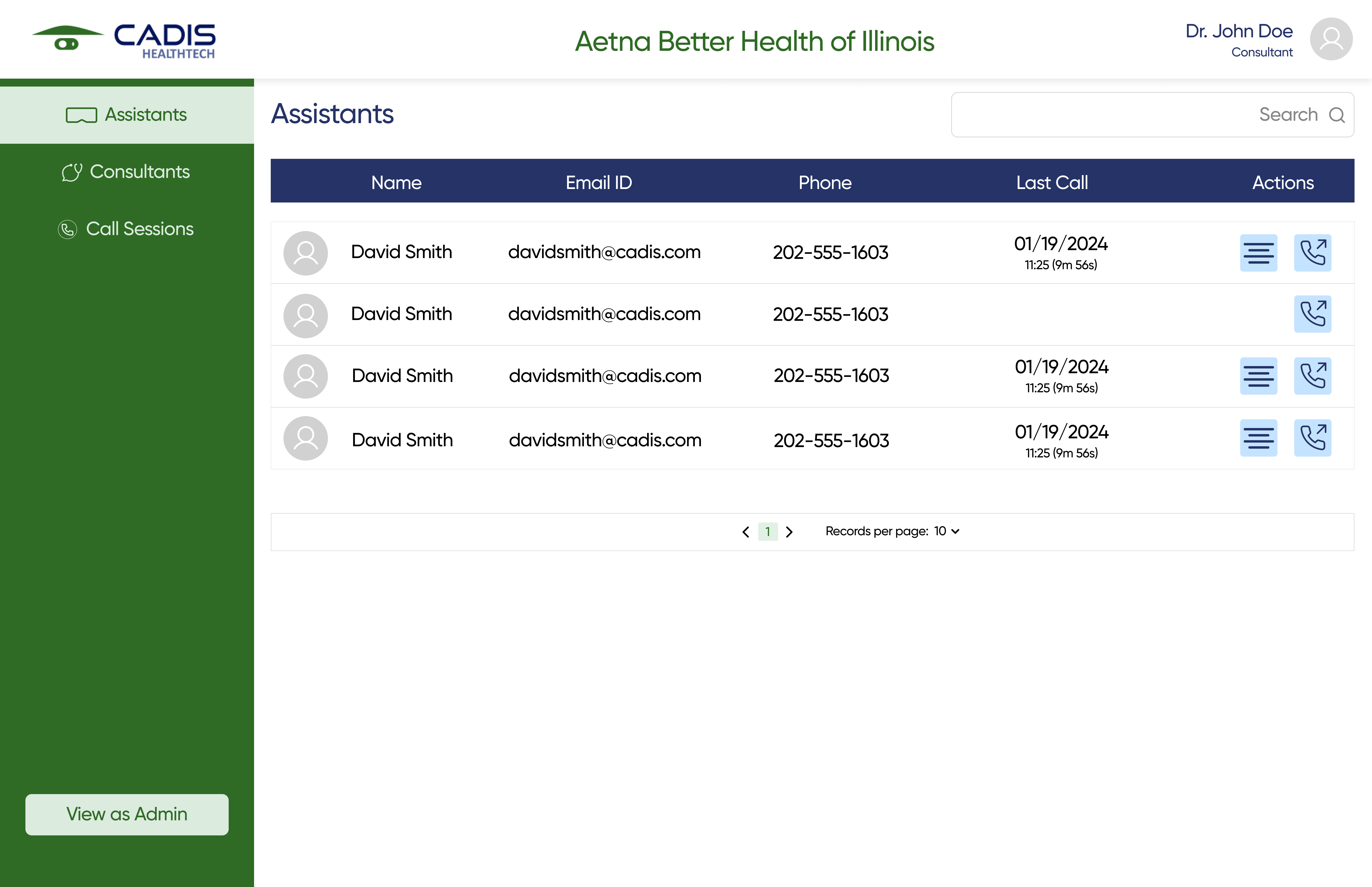
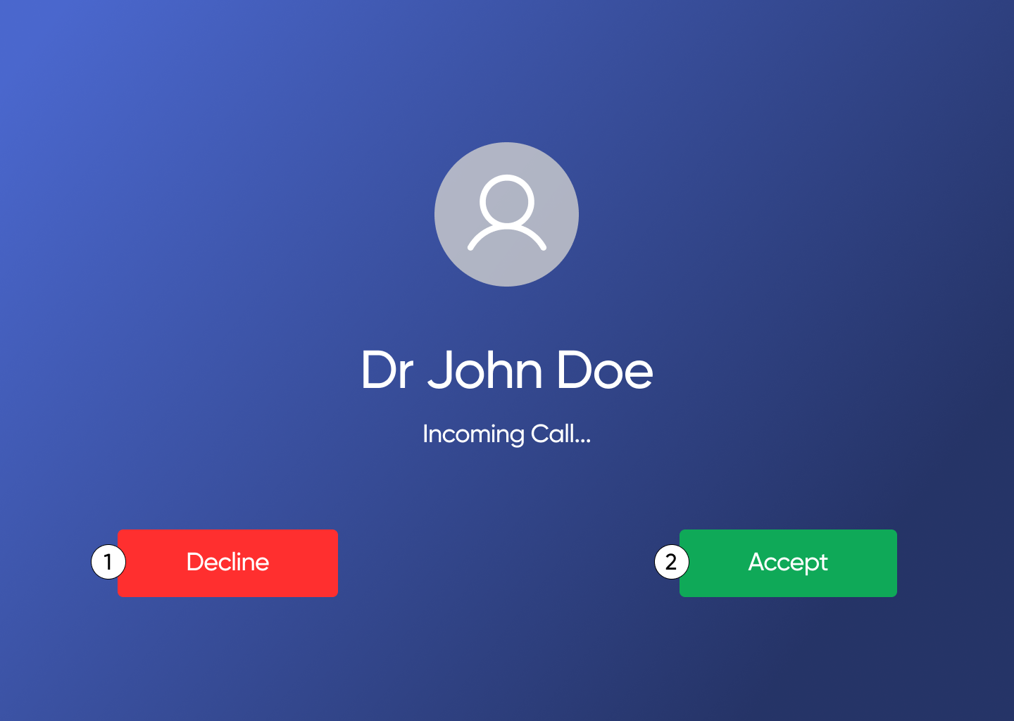
Cadis EziExpert →
I joined a live commercial product mid-build as the only UX designer. Audited, designed, shipped.
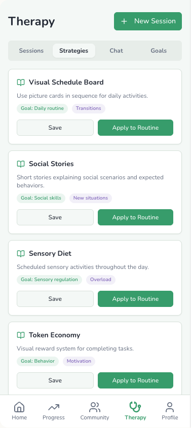
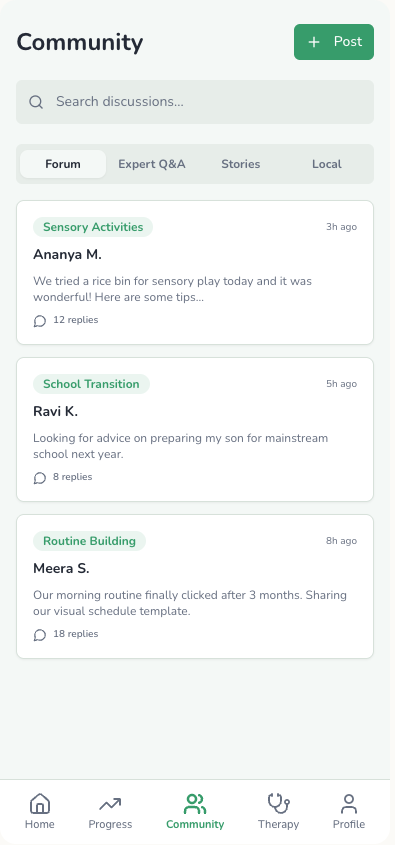
Thesis · Concept Project
AutiMate →
Accessibility design. Started with the wrong user — research proved it, and I changed the brief.
If you're building something and need a designer who can work from brand to shipped product, let's talk!
build together?
Get talking →